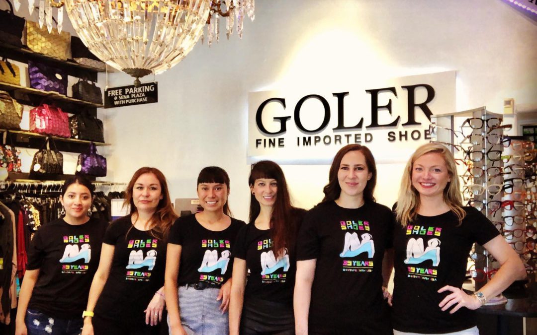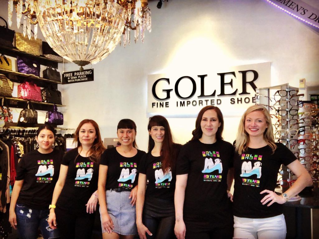
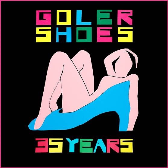
I would have ensconced this bathing beauty in that shoe whether anyone else had use for her or not, but I was hoping Guadalupe and Paula Goler would take notice.
It began with a favorite painting by Matisse. A large, pink nude oil on canvas. The blue squares in back remind me of bath tiles. I love this Fauvist fantasy. How dare we borrow inspirations from this image to sell shoes!
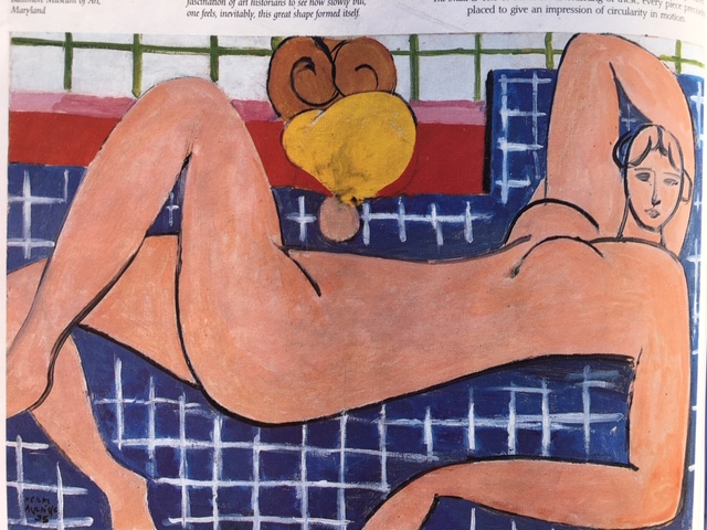
Then I remembered Matisse’s cut-outs from his final decade. Really, what better way to sell shoes? When he grew too frail to stand before his easel, Matisse went to bed with a pair of scissors and his craft flourished for another decade.
Matisse’s first cut-out project was an artist’s book entitled “Jazz”. Matisse made his images with the improvisational immediacy of the music he loved. I developed my design in the same spirit. One jazzy, giant leap in my imagination put that bather in a high-heeled shoe, which immediately gave my scissors something to riff on.
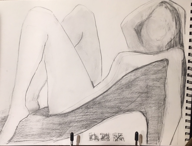
The entire improvisation began by applying graphite stick to smooth paper 11”X14″
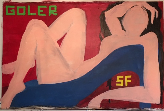
Next step was to painted on canvas in an acrylic 36”X48″ Not great, but it is linked to Matisse’s bather, in as much as both were executed rapidly on canvas.
Then came the cut-out, first in monochrome “24X32″
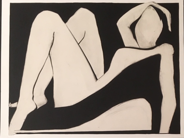
As you can see, each stage yielded some interesting work. The monochrome version is an instant classic.
The next version of this poster was very close to final color scheme. The font was achieved by sharply tearing and pasting strips of masking tape in four different colors and laying them down quick and dirty. The crumpled look wasn’t quite right, but I loved the graffiti-like result.
Craft Paper and Art Tape on Art Card “24X32”
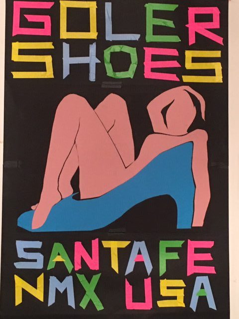
In the final analysis, those letters illicit a kitchy resemblance to some faux primitive scripts that recall hand-painted signs of the Old West. Those were later appropriated in the modern era to accent the culture of the native American. The “A”s, for example, look a bit like teepees, and that somehow made the lady in the shoe look like a sexy squaw stereotype, which was never my intention; but it got me round to thinking more carefully about appropriation and also how even subtle differences in fonts can send mixed messages and even confuse the intent of a piece.
Craft Paper and Post-it Notes on Art Card “24X36″
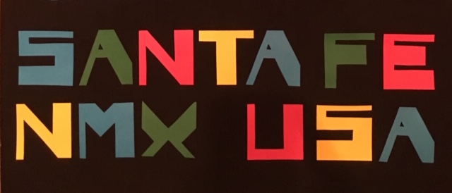
Whereas, I had carefully outlined every section of the lady in the shoe, then surgically removed them, piece-by-piece with a razor, the final version of the text, I snipped out, letter for letter, with scissors, free-handed, experimenting with multi-colored, 3” square Post-it notes.
Fonts are a fascination of mine that go back to my hand-lettering days. The one above was custom made. The emphasis is weight-forward, in counterpoint to her laid-back posture, but conforming still with the low center of gravity.
But what is most identifiable, for me, in this assemblage of brightly hued pulp and post-it notes, is romance encoded in the mating rituals suggested by high-fashion and grooming. The image of the bather in a shoe implies that luxurious comfort and enticing design combine at Goler.
And I think the way the feminine form and the footwear meet in this image, encourages us to think of the act of shoe shopping as more than just buying something to walk around in. Imagine, a high-heel as cozy as a bubble bath. Ponder how purchasing the right shoe can also be just as much of a prelude to love. Can we forgive the image for its old-school pin-up sensibility? Yes, because we cannot deny that pretty pink outline of the female form pays respect to classic works of Matisse.
The color pallet may have a positive resonance with the Meow Wolf crowd, as well, but Meow’s colors are actually, as it turns out, as generic as Post-it notes. Post-its are an especially apropos appropriation for a shoe store, thanks to office couture and the endless search for ideal heels.
Happy 35th Year GOLER! Andale!
