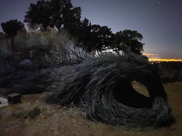
Shrubconscious Basket Hut

The basket hut came as a result of my lifelong passion for shelter, beginning with studying adobe building construction after high school. The art of shelter developing more deeply when I was employed full-time in the construction trade for ten years, and also by my experiences with living close to the land for most of my life, in tents, tipis, cabins and shacks.

The inspiration for this shelter grew out of my desire to explore indigenous plants as a source of raw materials. At the same time, I’ve grown increasingly concerned with the needs of the growing homeless population. The third world is rife with examples that exhibit incredible ingenuity. As homelessness becomes more widespread, it is conceivable that making shelter from indigenous plants will become more commonplace even in the developed world.

This hut utilizes what are known around here as latillas – roof and fence poles fashioned from pinion trunks. We drove them into the ground about 16 to 20 inches in an ovular shape then began weaving apache plume branches in and out. Meanwhile the floor was smoothed out and layered densely with aromatic plants to make it soft, inviting, and insect free.

The process of working out the roof took awhile to decide on. I had originally envisioned a type of whirligig design. I made numerous models and in the end, we sourced renewable bamboo canes from a local nursery and lashed them to the upright pinion latillas and settled for a simple sloping shed roof. Then the thatch for the ceiling and roof was furnished by weaving green chamisa branches, in-between the bamboo gridwork. A woven willow trellis serves to surround the structure and line the walls, with salvaged privet stalks braced vertically as ribbing inside and out, for added character. The little broom at the front door makes me think some wee little witch lives in there.
Graphics Lab Showroom

As each project spins off more and more possible outputs, there is no time to bring every new iteration to full fruition, so this gallery documents important watersheds of novel results, framed inside a moment in time in the studio, for potential further examination and exploitation.

The earliest influence for my 2D graphics fascination goes back to my childhood in the 60’s, which birthed an explosion of highly influential graphic content. I mimicked some of those memes to create popular posters for my friends running for school government positions. In the house in which I was raised, there was an enormous illustrated Bible featuring those epic etchings of Gustave Doré. I find them just as mesmerizing now as ever.

Later on, when working at the Penrose Library public information office, not only was I there to design and make all kinds of posters, pamphlets, fliers and signs, I was spending extensive periods in their art, film and fashion stacks, absorbing more influences than I can list here, but Albrecht Durer’s and Rene Magritte’s output have remained favorite artists of note, as have Annie Leibowitz, Diane Arbus, Richard Avedon and Phillip Halsman’s photography.

Also, for three years I worked as a magazine and paperback deliveryman, where the the power of word and image were front and center in my day-to-day life. I delivered everything from TV Guide and Sporting News to Vogue and Playboy, paperback novels too. Print media was a primary way that people got information.

Frank Frazetta was a graphic artist that captured my attention during my youth. His contributions to “Heavy Metal” magazine, as well as numerous popular LP covers, got my imagine fired up. The underground comix of the era were hugely influential beginning with those published by R.Crumb and his contemporaries, also the LP record and book cover art of James Grashow, the brothers Hildebrandt, Bengt Nystrom and Robert Giusti.

Later on, our attention was significantly drawn to Paula Scher, activist collectives such as Gorilla Girls and let’s not forget Polish film poster designs, especially those of Andrzej Klimowski.

The evolution of print media continues to be a major area of interest. Cooper-Union at the Smithsonian is a wonderful resource. The art form is so compelling, we can’t wait for the next gig. Need a poster, flier, zine or logo design? Let’s talk.

Attempting Homages

For several years I occupied my studio time making homages of old masterpieces. Most of these were painted between 2003 and 07. This batch of paintings built my confidence. Reinventing a masterwork with modern materials is so much easier than inventing one from scratch. That is obvious, but the rewards of doing so kept me coming back. I studied my subjects like a free climber studies a rock face. I followed their guidance like a trusted guide’s footsteps. I tried to scale their brushwork, color choice, composition logic, etc. It’s never about perfection, but one hopes to get a reference point for the fine motor skills, dilated senses, and unconstrained imagination of the virtuoso, in ones own nervous system. To attempt to recreate each work with nothing but a freehand, a patient eye, some fine paper and acrylic paint- it impresses me now that I was willing to invest the time. These weren’t commissioned works, just studies. But for me, each one was a worthwhile masterclass from a genius.