Tea House Shelter
A small and surprising tea house rises from the Southwestern desert.
Watch more videos from Open Channel Content on our YouTube page, here.
A small and surprising tea house rises from the Southwestern desert.
Watch more videos from Open Channel Content on our YouTube page, here.
Film Commentary has been an absorbing pastime for more than a decade. Since I graduated film school, I’ve posted almost 100 articles on the art of film, filmmaking, mass media, and classic and global cinema. Amid these many dispatches there is an entire series featuring sci-fi masterworks entitled “Nature and the Machine – Sci-Fi Cinema.” There is another batch entitled “Seven Greatest Films Ever Made.” The latest series, still in progress “Films of Our Enemies,” features titles from places that our country considers a threat.
Each country’s films proves our common similarities are more than our differences, no matter what the cultural origins. One can not easily dismiss anyone in these movies as being very different from us. Otherwise, we could not watch their films and feel the way we do. We find empathy for the protagonists and feel enmity for the antagonists, just like we do in the films made by folks closer to home.
A new short from Stryder Simms, 2021.
“Ode d’ Brew” with Brendan Wedner, Stephanie Nagler and Matt Sanford. Written and Directed by Stryder Simms for Open Channel Content, with music by Jake Sproul. Special thanks to David Aubrey at Lighteningwood in Santa Fe and Scott Roche at Coupe Studios in Boulder.
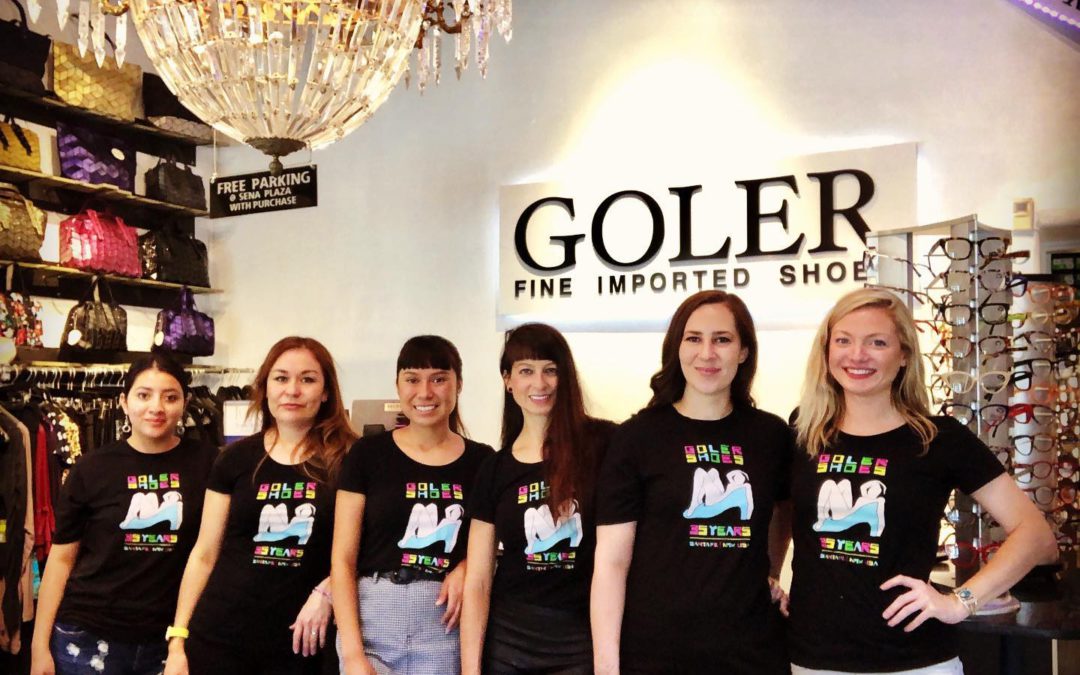
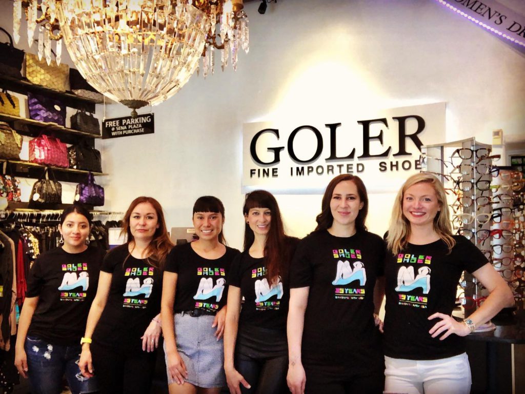
I would have ensconced this bathing beauty in that shoe whether anyone else had use for her or not, but I was hoping Guadalupe and Paula Goler would take notice.
It began with a favorite painting by Matisse. A large, pink nude oil on canvas. The blue squares in back remind me of bath tiles. I love this Fauvist fantasy. How dare we borrow inspirations from this image to sell shoes!
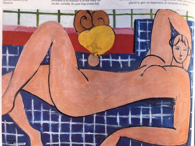
Then I remembered Matisse’s cut-outs from his final decade. Really, what better way to sell shoes? When he grew too frail to stand before his easel, Matisse went to bed with a pair of scissors and his craft flourished for another decade.
Matisse’s first cut-out project was an artist’s book entitled “Jazz”. Matisse made his images with the improvisational immediacy of the music he loved. I developed my design in the same spirit. One jazzy, giant leap in my imagination put that bather in a high-heeled shoe, which immediately gave my scissors something to riff on.
The entire improvisation began by applying graphite stick to smooth paper 11”X14″
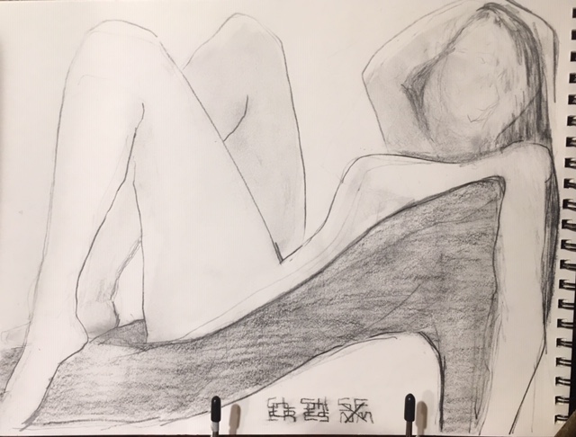
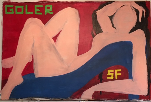
Next step was to painted on canvas in an acrylic 36”X48″ Not great, but it is linked to Matisse’s bather, in as much as both were executed rapidly on canvas.
Then came the cut-out, first in monochrome “24X32″
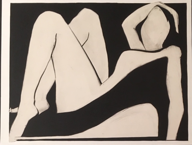
As you can see, each stage yielded some interesting work. The monochrome version is an instant classic.
The next version of this poster was very close to final color scheme. The font was achieved by sharply tearing and pasting strips of masking tape in four different colors and laying them down quick and dirty. The crumpled look wasn’t quite right, but I loved the graffiti-like result.
Craft Paper and Art Tape on Art Card “24X32”
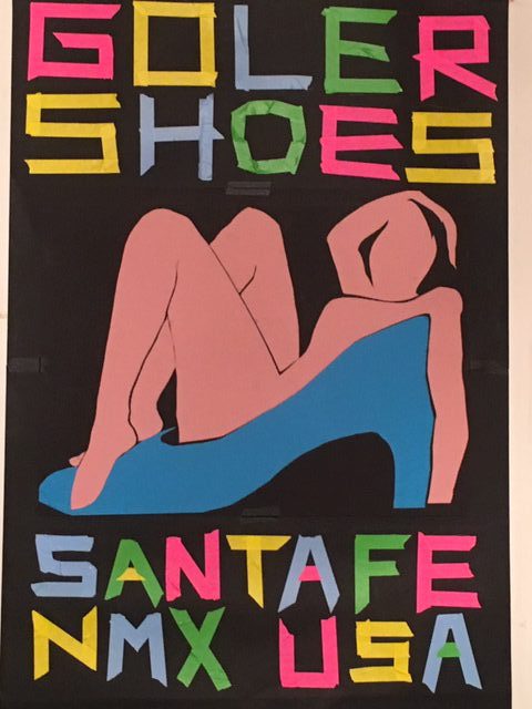
In the final analysis, those letters illicit a kitchy resemblance to some faux primitive scripts that recall hand-painted signs of the Old West. Those were later appropriated in the modern era to accent the culture of the native American. The “A”s, for example, look a bit like teepees, and that somehow made the lady in the shoe look like a sexy squaw stereotype, which was never my intention; but it got me round to thinking more carefully about appropriation and also how even subtle differences in fonts can send mixed messages and even confuse the intent of a piece.
Craft Paper and Post-it Notes on Art Card “24X36″
Whereas, I had carefully outlined every section of the lady in the shoe, then surgically removed them, piece-by-piece with a razor, the final version of the text, I snipped out, letter for letter, with scissors, free-handed, experimenting with multi-colored, 3” square Post-it notes.
Fonts are a fascination of mine that go back to my hand-lettering days. The one above was custom made. The emphasis is weight-forward, in counterpoint to her laid-back posture, but conforming still with the low center of gravity.
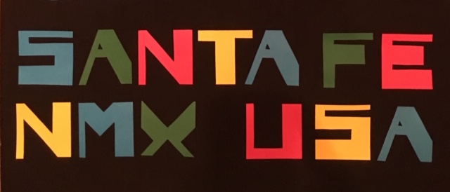
But what is most identifiable, for me, in this assemblage of brightly hued pulp and post-it notes, is romance encoded in the mating rituals suggested by high-fashion and grooming. The image of the bather in a shoe implies that luxurious comfort and enticing design combine at Goler.
And I think the way the feminine form and the footwear meet in this image, encourages us to think of the act of shoe shopping as more than just buying something to walk around in. Imagine, a high-heel as cozy as a bubble bath. Ponder how purchasing the right shoe can also be just as much of a prelude to love. Can we forgive the image for its old-school pin-up sensibility? Yes, because we cannot deny that pretty pink outline of the female form pays respect to classic works of Matisse.
The color pallet may have a positive resonance with the Meow Wolf crowd, as well, but Meow’s colors are actually, as it turns out, as generic as Post-it notes. Post-its are an especially apropos appropriation for a shoe store, thanks to office couture and the endless search for ideal heels.
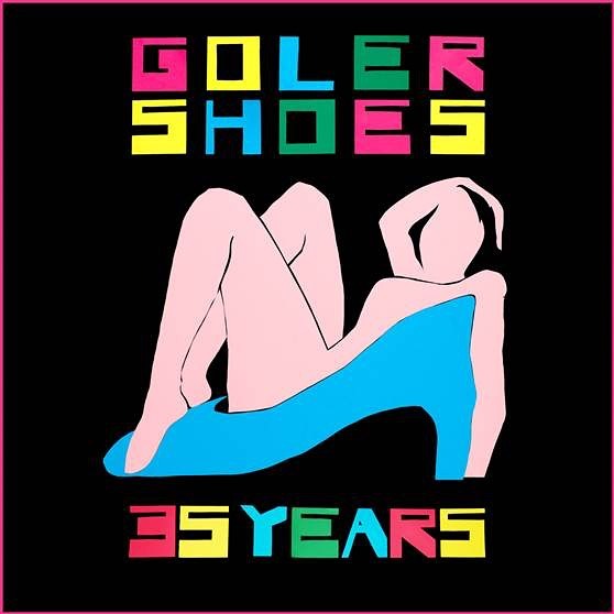
Happy 35th Year GOLER! Andale!
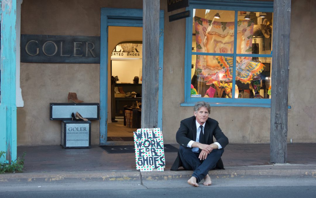
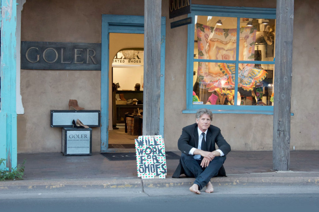
Know why shoes became such a big deal to me? Me at ten years old cramming my feet into a certain pair of Buster Brown’s long after they were outgrown. I had eight brothers and sisters. The budget didn’t quite keep pace all the time. In this photo, you can see my hammer toes. So when I say I’m a “shoe freak,” look at poor me, my toes are literally kinky.
It was my intention with this snapshot to infer that they honor feet at Goler, and good shoes are capable of offering so much more than mere protection. They’re symbols of identity, indicators of relative security. Silly as it may sound, evolution is what makes shoes and feet sexy. Combining art and technology for ambulating the body has a universally authentic ring. It’s a primal thing–another explanation for why, “the shoes make the man, or woman, or anything in between.”
This photo also makes light of a rather serious situation, but I did not intend it to trivialize the plight of the street people with this piece. My pose indeed mimics those unfortunate ones asking for hand-outs, with hand scrawled cardboard signs, perched on curb sides, whenever commuter traffic’s at high tide.
Someone told me they caught a cardboard sign holder making so much money the IRS went after him. I think that’s an isolated case. I don’t know what I’d do if I was reduced to begging. I can never just sit around.
The facts are, most people probably only do it out of desperation. Some do it out of habit, of course, others have made a total racket out of it, no doubt. Some beggars are creative about it. There’s a lot of panhandling that blurs the line. One could even argue that street performing, for passing change, is the same vice. More power to the troubadours. If they can get us spontaneously tapping our toes or bobbing to the beat, why not reward them?
Incidentally, no one came up and offered me work in exchange for shoes during this photo session. Good thing, too. I can’t take on any more for the time being. I’m in the middle of other projects which you will discover in future posts.
As an artist there are more pressing priorities, in real life, for me, then where my next pair of shoes comes from. So, when the idea came for the shoot, it began with the sign. I grabbed a random piece of cardboard in my studio, just to get it over with. It happened to be dotted with Christmas colored polka-dots and originally purposed for shipping presents through the USPS. Dots are fun. Now how can we make the letters pop on top?
Black tape is one of my current favorite line-making methods for sketching out big, bold figures in the most direct fashion and the least amount of time. If you draw from life, try to sketch a nude in life size with black tape.
You can’t always make tape do what you want, but if you let it do what it can, it’s full of surprises. So much depends on how you aim, fold, peel and tear. Making marks with it involves much more of the body and therefore, leaves behind kinesthetic evidence. This imparts dynamic tension to any text. The folds and wrinkles enrich the bold strokes with black-on-black detail. We can see and feel it. Lovingly piloted, the edge of the tape takes place of a pencil or stylus to establish the font’s pleasingly varied width and shape.
With slogan and sign in hand, then, it was just a matter of deciding where exactly on the curb to sit. I discovered that spot, not so much because of that big colorful window display, which I wrote about in the last post already, but because of the tiny BUY LOCAL sign in the bottom corner of the window just above my head.
The time of day was another decision. Santa Fe has so many moods depending on what the desert sky is doing. We got there just before sunset. Finally, throwing on the sport coat and tie I hoped would eliminate any inclination to read it pitifully. I have money in my pocket, most likely. Anyone can easily deduce that I’m just making a play for your focus, which will deepen, with time, and end up in the open door and the Goler store.
I had some lean times growing up. I thought I might have to go the homeless route more than once. Thankfully, I never have. Not so far. So the photograph is a sort of celebration of that fact. Even if you didn’t know that about me, I hoped you’d get a laugh out of that decked-out dude with his priorities skewed. If I ever do have to ask for charity, I’ll be grateful for times like these.
Art has many lives. My art is constantly reincarnating and redefining its purpose. There are so many ways I’d like to reach out and connect to others with mine that I haven’t even tried yet. It’s about time.
We will segue from my years in fashion and my fascinations with displays and shoes, to my past decade exploring sculpture, using indigenous plants, and how I am now incorporating them into architecture.